Logo Design: Detailed Minimalism Technique
Vector logo design can be tricky if you don’t know where to start and how to organized the process, let’s dive in and show you how to accomplish a professional look to yours.
1. Deciding on our overall vibe
Color
Color choices for your logo can make or break a project. There are an infinite amount of choices that can be made but with a little research and study you’ll find plenty of information like this detail explanation of color choices and their effect on a person’s emotions.
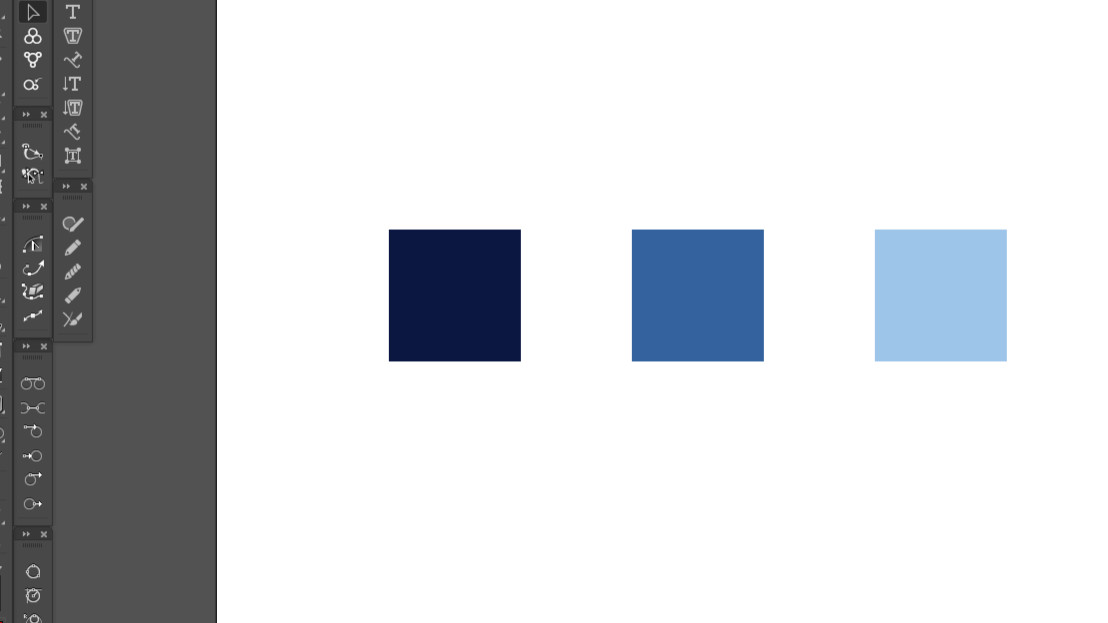
Once you understand the “voice” your logo is trying to express for your branding project we’ll select 3 different tones of a small degree of hue on the color wheel.
We’ll select these:
- Dark – We’ll use this for the Contour and lineart.
- Midtone – Will use this as the overall base of color.
- Highlight – Will use this to create the single light hitting our subject, it will add dimension to the object.
**TIP – In Adobe Illustrator, make sure to create new swatches for each new color we select and make them “Global” for easy, on the fly, edits for later changes.
Stroke Weight
After we’ve selected our color we need to decide on the overall line weight for the project. The style we’re working on lends itself to a thicker contour (outside line) while the inside detail strokes are small in comparison. This stage is pretty straight forward.

2. Laying down the strokes and staying consistent
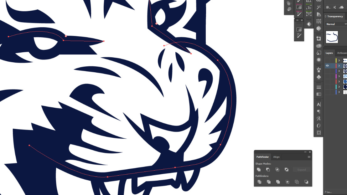
At this stage, you’re going to start lying down your lineart for the piece. You don’t want to go to war without a strategy or something to give you good grounding to be able to gauge if you’re running off the rails in the process.
- Decide your outter most contours stroke weight.
- Choose what the inner details line weight/s will to be. (Keep it in the wheel house of the contours)
- Make sure to keep your Anchor/Node count down to a minimum when creating paths
- Simplify the details to only describe overall gesture for the shape or form you’re describing.
- Using the darkest color from your chosen pallet is ususally the best route to go.
**TIP: Keep track of stroke weights easily by saving the appearances you apply by creating new “Graphic Styles” in the Graphics Styles Panel ( Main Menu: Window>Graphic Styles )

3. Pushing through to the finish
Now that you have your lineart complete, we need to lay down some color. The first part is simple, just use the lineart to create the overall shape for the logo. emblem or icon your creating.
- Select all the lineart and expand it a couple times (Object>Expand Apperance and Object>Expand)
- With the lineart expanded, select all and in the Pathfinder choose “Unite”
- With all the lineart now United into one shape/object, apply the middle tone of color to it.
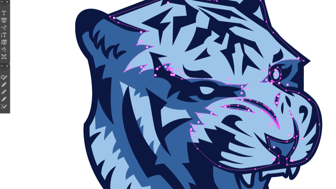
At this point you have a nice base of color to work from. Create a layer above the middle tone objects, layer. The stacking order should go as follows:
- Lineart Layer (Locked)
- NEW LAYER
- Middle Tone Object Layer (Locked)
Now you can start to laying the highlight color. You goal is to create objects/shapes that repesent the highlights on an object that are for instances, being shine down upon by a spot light, in a dark room. Think of how a cube would be lit if it was in a dark room with only one light shine down onto it.
Think of how a cube/box would be lit if it was in a dark room with only one light shining down onto it. The top side would receive the most light thus it would have a light shape in our artwork, in this scenario.
Keep with the detailed minimalism idea referenced earlier, only use limited, neccessary anchor points to describe the gesture of the form your trying to describe.
After you’ve layed in the highlights, you’re done. There’s multiple ways to button up cleaning the file with expanding paths and merging to clean up but I wont go into that here.
If you’re interested in looking at the file for this tutorial check the link below, it’s only a share and that goes a long way in in helping us here at Pixel Moshpit. It’s your support that keeps this stuff coming in the future.
